On Monday we had our first design review of the interactive world, and I honestly could not be more excited with how it’s all coming together.
From starting with the initial intervention:
To creating maps and sketches of the VR environment:
To the 2D design being finalised:
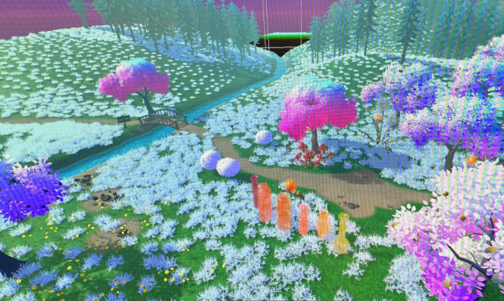
To actually creating the VR world we could walk through, with assets, animations and textures added:
It felt really rewarding to see the world come to life in terms of the spatial design, and that our work over the last few months had finally paid off.
Notes from first design review:
- make grass more blue, ground colours generally brighter
- have a sign next to each gameobject signifying what the exercise is (eg. spine stretch, visualisation, body scan, etc.)
- add the animations for each object, make sure the colours stand out from the environment
- change path layout to circular/eg. clearing in the woods
- keep bridge and water feature – perhaps meeting at a pond- like space where the bubble object can look natural in the space
- change background mountains to more abstract rock-like shapes – and taller
- using controllers to teleport the user to objects instead of them having to walk around in the real world